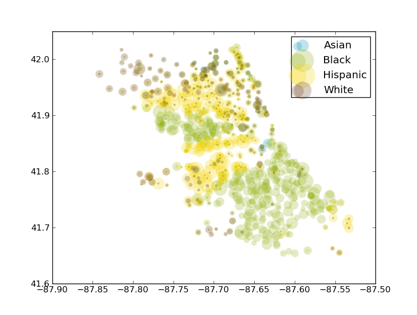
I created this image using matplotlib and the data from my CPS Racial Data Warehouse project. Circle size represents school population. The axes are latitude and longitude (as a reference, the loop is the empty rectangle just below the left corner of the legend). Also I should note the Native American population was excluded from this image because of a technical issue.
Full size image here, more on this project soon (in the meantime, the code is here).
Comments !